Romantic Era Art Exhibit
Romantic Style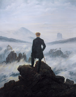 |
| Wanderer above the Sea Fog by Caspar David Friedrich, 1818 Hamburger Kunsthalle, Hamburg |
When viewing this piece, the contrast is very apparent between the dark coat and rocks compared to the blues and whites that are in the waves. To me this helps draw to the eyes to the man who is in the middle of the painting. The lines and texture also play a key part in this piece as well because the hard crisp lines of the rocks compared to the light feathery look of the water with more muddled lines adds different elements to the painting that make it come to life.
There are a lot feelings that can be pulled from this painting. The man standing on solid rocks above a roaring sea makes me feel like he has overcome something and is looking down at the way he has come. It could also mean he is looking at the path is supposed to take to success. I like to think he is looking behind him, but it all depends on the viewer. I would own a print of this painting. It has such great elements that make it an interesting piece.
 |
| The Ninth Wave by Ivan Aivazovsky 1850, St.Petersburg, Russia |
Like the previous piece, this painting uses the element of water to elicit feelings from the viewer. Looking at this piece, it makes me feel like the small boat is in the middle of a struggle for survival against the waves that are surrounding them. The light in the distance offers a feeling of hope that they will make it to their destination. I love how this painting looks so realistic and shows how beautiful the sunrise is across the ocean.
The painting really put texture to use when it comes to the waves making then look like they are moving. Along with the texture, the lighting is also essential to the piece. It helps give the painting depth and allows for the waves to have yet even more texture by giving them a rippling effect. When it comes to shape, I think it is an important aspect to this piece. The waves are very round and flowing, while the boat is more boxy with straight lines allowing for a metaphorical contrast to be derived. Examining the boat, it is shaped similar to a cross giving the painting a religious aspect as well.
Impressionism
 |
| Wheatstacks (End of Summer) by Claude Monet, 1890-1891, Giverny, France |
 |
| Basket of Apples by Paul Cezanne, 1893, France |
Comparison
Sources:
“Wanderer above the Sea of Fog.” Encyclopædia Britannica, Encyclopædia Britannica, Inc., https://www.britannica.com/topic/Wanderer-Above-the-Sea-of-Fog.
“Ivan Aivazovsky Paintings, Bio, Ideas.” The Art Story, https://www.theartstory.org/artist/aivazovsky-ivan/#:~:text=The%20title%20refers%20to%20a,technique%2C%20theme%20and%20populist%20appeal.
French, Claude Monet. “Claude Monet: Haystacks (Effect of Snow and Sun).” The Metropolitan Museum of Art, 1891, https://www.metmuseum.org/art/collection/search/437122.
“The Basket of Apples.” The Art Institute of Chicago, Painting and Sculpture of Europe, https://www.artic.edu/artworks/111436/the-basket-of-apples.
Aitken, Peter. “A Guide to Romanticism, Realism, and Expressionism in Art.” Wentworth, Wentworth, 19 Oct. 2015, https://www.wentworthgalleries.com.au/news/2015/10/8/a-guide-to-romanticism-realism-and-expressionism-in-art.


Great Post Juliana! I also had in my blog "Wandered above the sea fog". I touched on that artist because of the texture, and elements in the art, and I could feel the emotional connection behind the art from its historical background of it. I like this theme blog post because I can connect more to this style and can see the full picture and meaning of it. Thanks for sharing. I did learn a few things from your other choices of artwork.
ReplyDelete